Wizopawdia
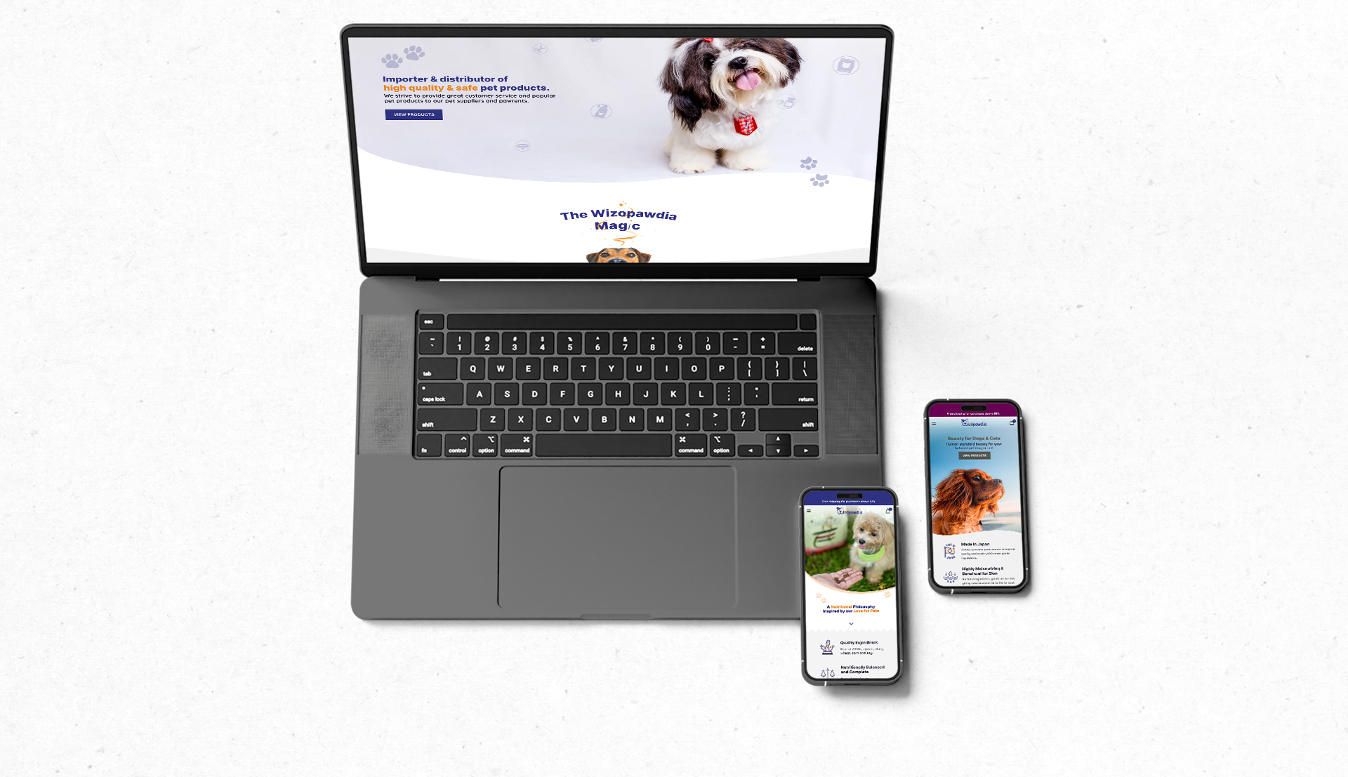
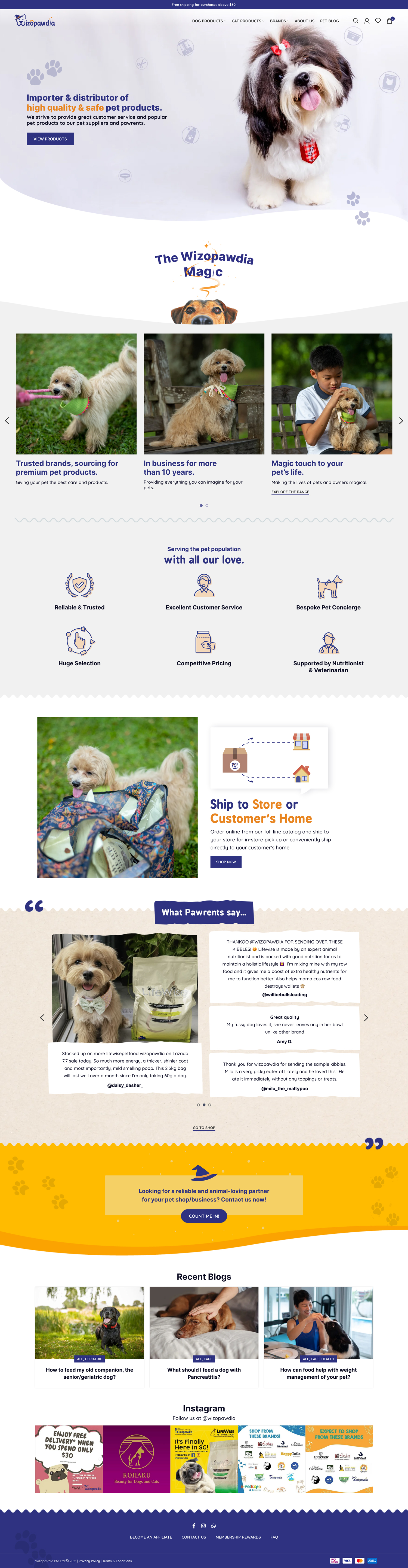
View WebsiteWizopawdia, a startup started in 2021, is a wholesaler and distributor of quality pet food and products. They approached us to create a lifestyle-oriented website to showcase and sell their products, as well as to act as a platform for their marketing efforts.
2021
The brief:
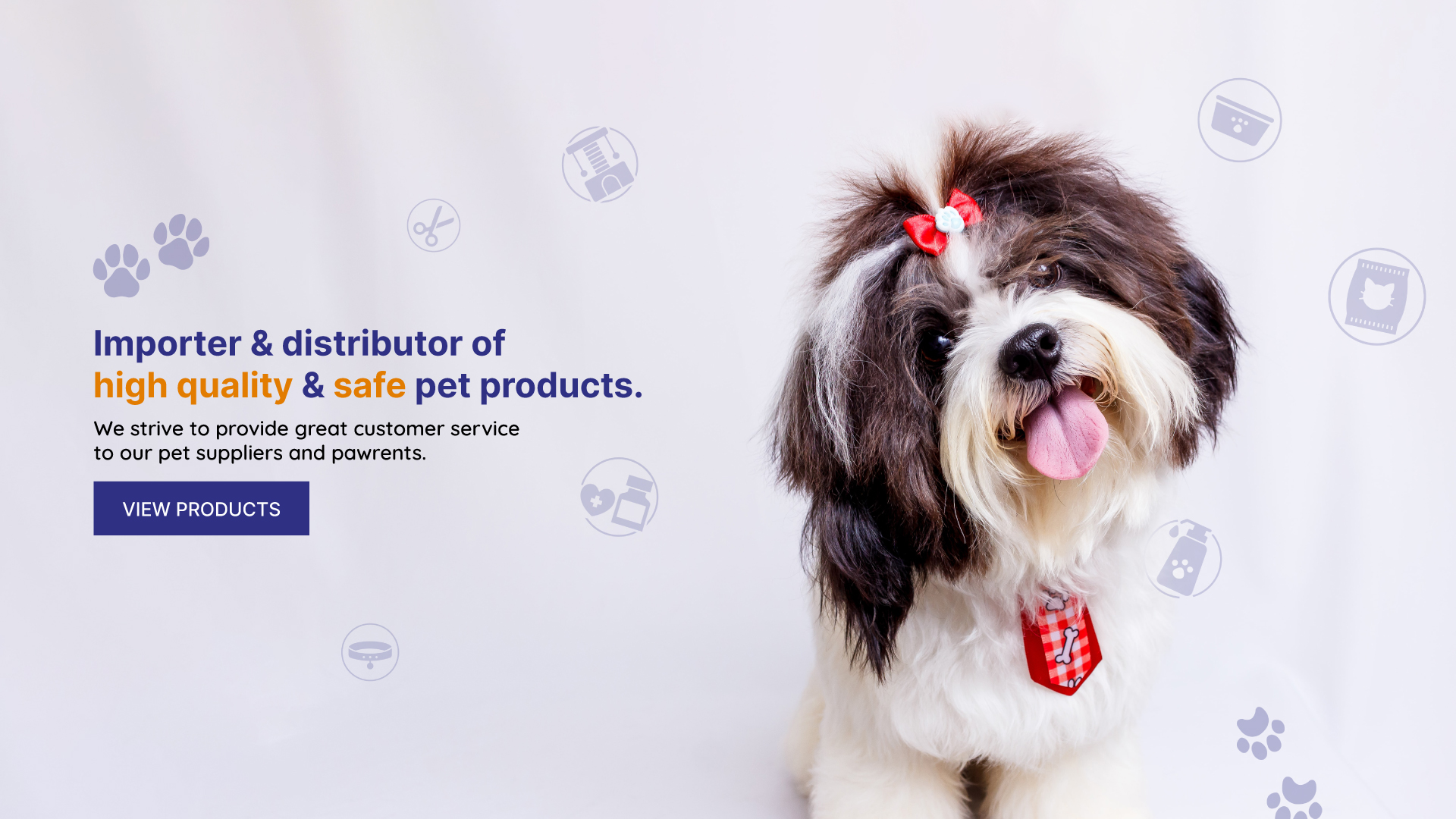
To create a lifestyle-oriented site that showcases Wizopawdia’s specialty in selling and distributing high quality products, hence attracting pet parents who care about their pets’ welfare.
Other than showcasing and promoting their products, the client also aimed to use the website to offer relevant resources, and engaging content to educate and inspire pet owners. They also wanted the site to attract potential partners that they could work together with.
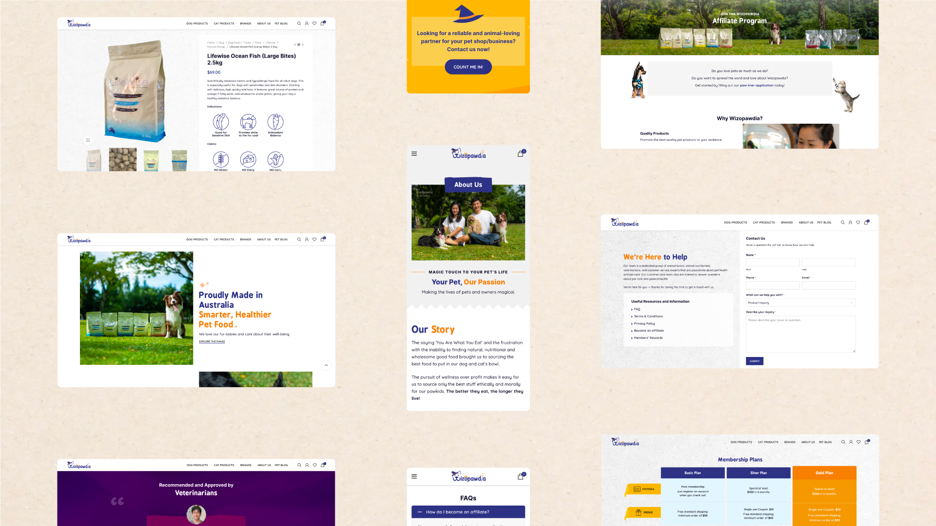
“Kohaku” and “Lifewise” brand pages
Halfway through the project, the client opened up the possibility of their company being a distributor of other brands, rather than just focusing on Lifewise products. They requested for an additional brand page for “Kohaku”.
Due to the significant differences in the colour schemes and the overall look and feel of the brand Kohaku, this posed a challenge in getting the brand page’s design to align with the rest of the site. After much delibration, I did up 2 mockups for the Kohaku brand page.
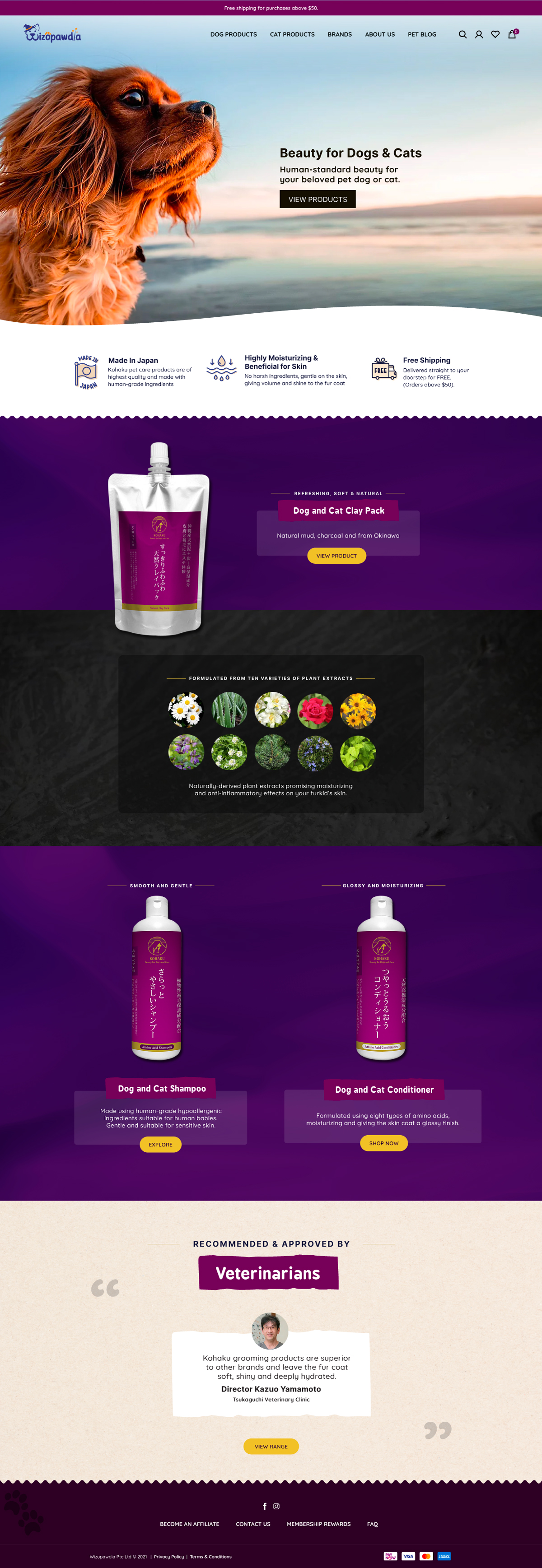
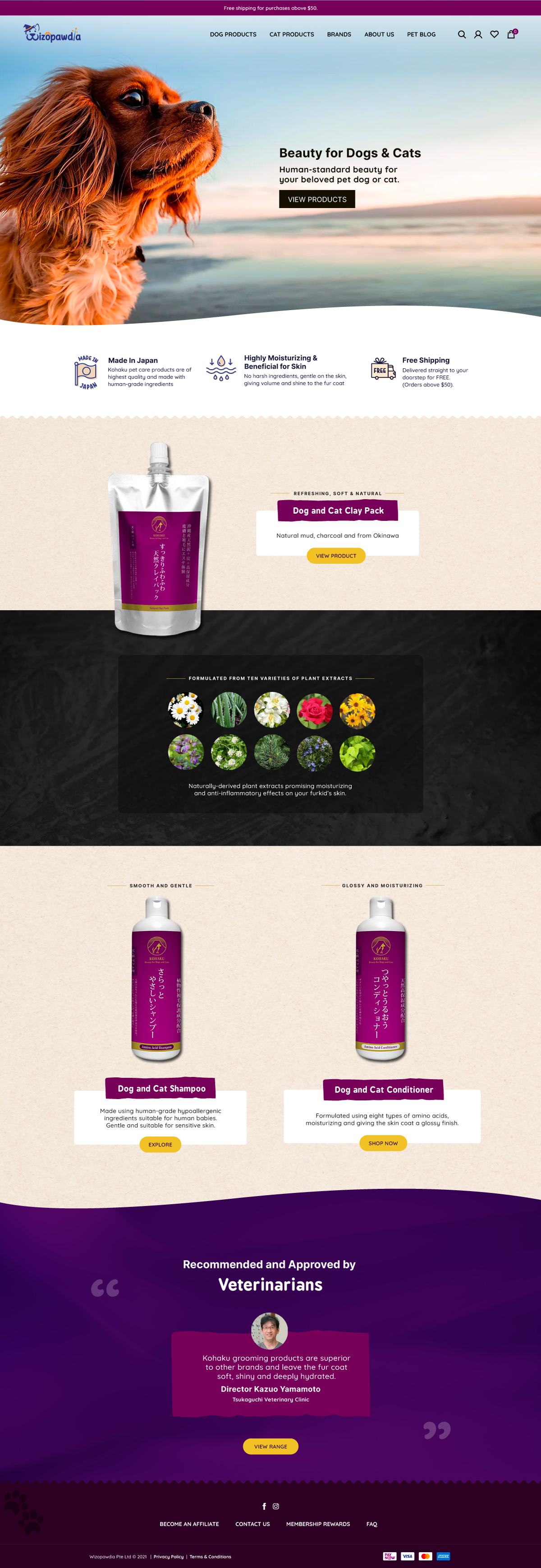
After discussion with the project manager, we eventually decided to go with the second mockup as the first one was a little too dark. Utilising the second mockup would also make it easier for the client to align the designs of additional brand pages, when required, in the future.
Creating a delightful experience through engaging graphics
To add life and interactivity to the site, designs that complement the website’s branding were carefully created and implemented on the site.
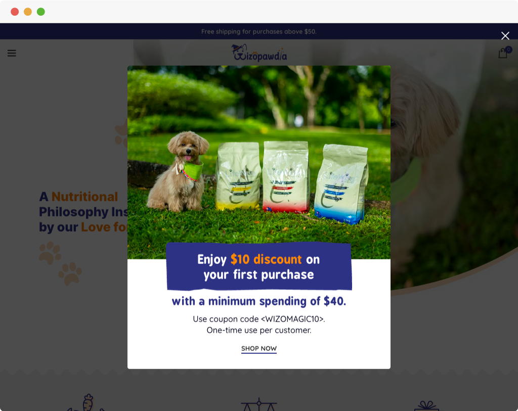
1. Promotional pop-up banner
With the photographs provided by the client, I tailored the pop-up banner to be eye-catching when the customer enters the site.
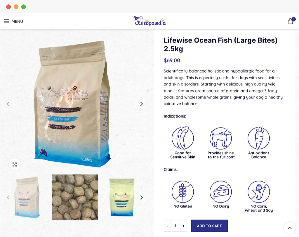
2. Icons for the product pages
The client requested for each of the product’s benefits to be displayed clearly, hence, I proposed the icons in the following style & format.
*The initial 6 icons done for the product “Lifewise Ocean Fish” were done up by me. As illustration of the individual icons for each product was a time-consuming process, the responsibility of creating the remaining icons for the rest of the products was assigned to an intern, who did an exceptional job.

3. “Choose your pet’s life stage”
This segment started off as a simple implementation of tabs and the respective contents. Later on, after reading about the possibilities of using CSS to change the mouse cursor, I went back to the page to create the SVG wand graphic and to edit the CSS for that particular section.
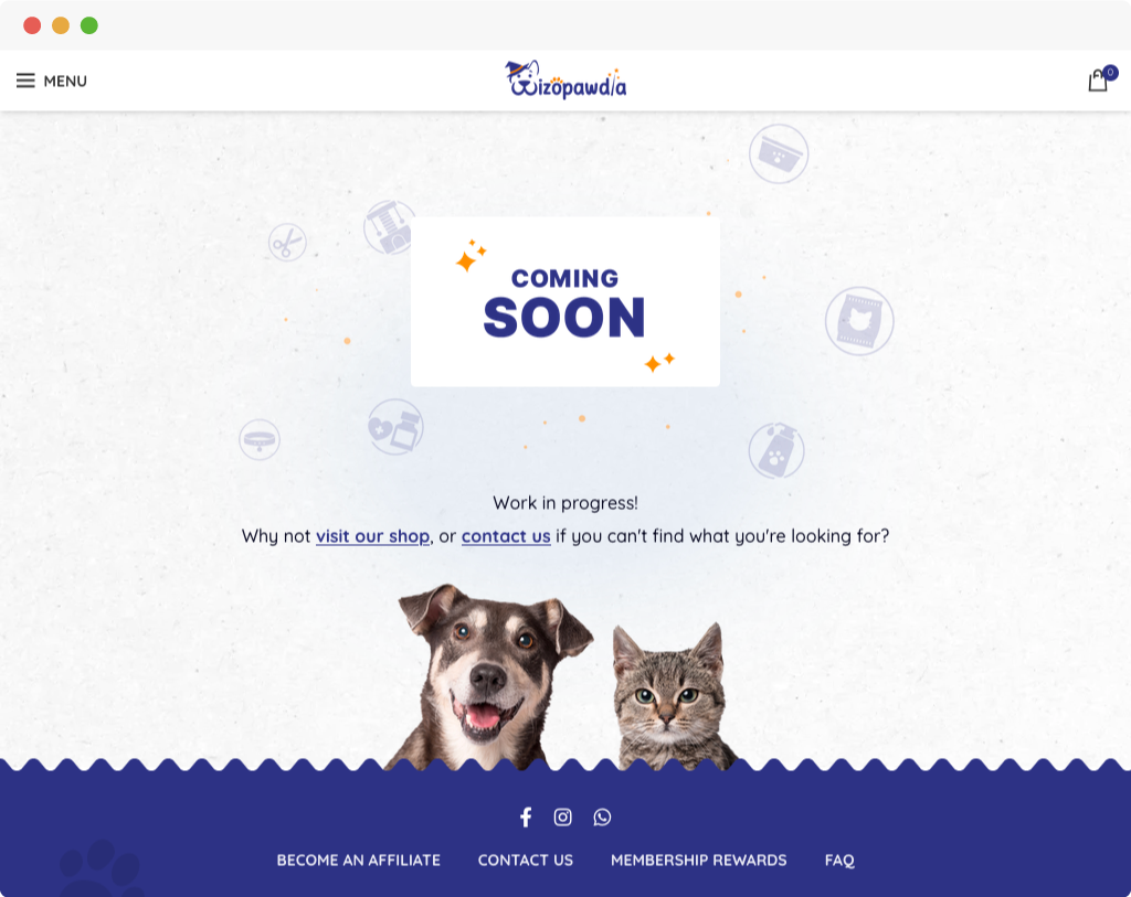
4. “Coming soon” for products that are unavailable
The client had mapped out their product categories, but several of them were unavailable. Hence, they requested for the placeholder for their products that were unavailable to be more visually appealing (I was required to edit WooCommerce’s “no-products-found” PHP template to do so).
The Outcome
A fun, yet professional-looking, site that can appeal to both potential customers as well as partners.
The site’s design also left the clients highly pleased with the outcome.